Source: Images and content by A Collected Man @ ACollectedMan.com. See the original article here - https://www.acollectedman.com/blogs/journal/skeletonised
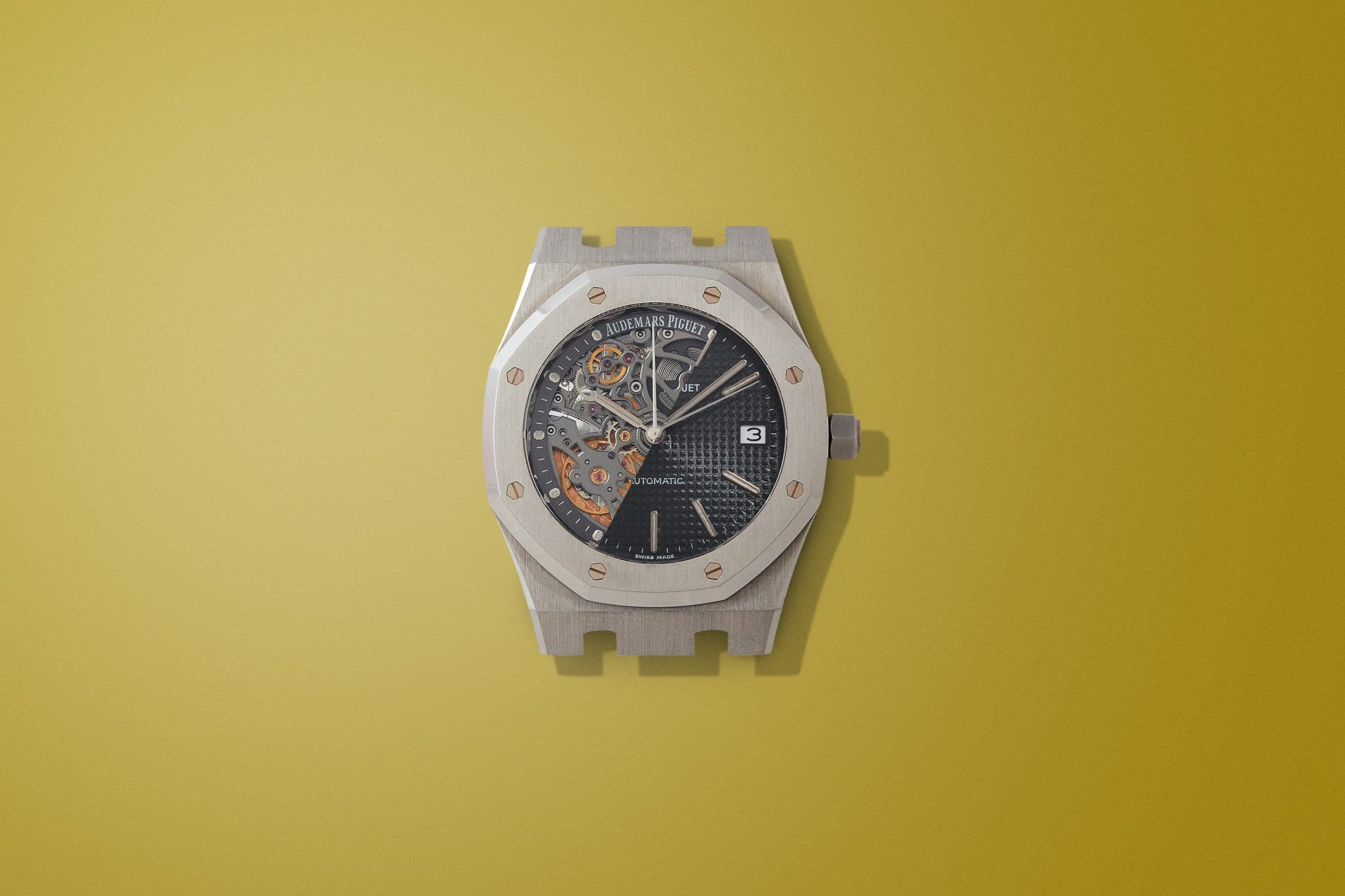
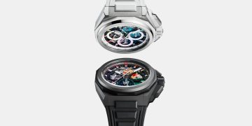
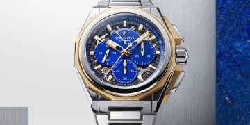
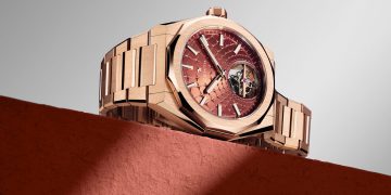
“Actually I think skeletonised watches are awful things and cheapen the whole look of a watch, but you probably don’t want to hear that,” laughs Smith. “Because skeletonised watches show off all the work that’s gone into them, they’ve come to be associated with luxury, so you can see why some people enjoy them. Some people like the intricacy. I think it just looks flashy. Skeletonisation works for me up to a point – when I design an open worked dial to expose some element below that’s really as far as I want to go, because that shows off the movement while retaining the integrity of the mechanism.”
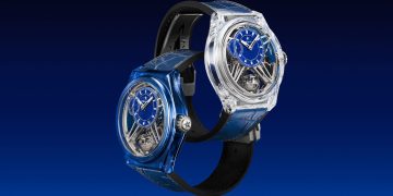
In time new materials may solve this problem of building in delicacy as the impact on a movement’s strength is minimised. But perhaps there’s also an aesthetic barrier, but this ultimately a matter of taste. Moves in watch design towards a state of invisibility – through the ever-greater use of sapphire to make a watch ever more see-through – follow a well-established design trope for other objects: pens, phones, bags, speakers, chairs, guitars, even, yes, toilets. Call it the iMac look, after the translucent desktop computer that revived the idea in 1998 (although Apple had been using the same see-through effect on lesser-known products for two years prior to that).
“I’ve always liked those illustrations in children’s books that show the complex workings inside something – a ship or a building or a submarine – with a kind of x-ray effect. But I don’t like the see-through effect in objects,” says Martin Frei, the designer behind Urwerk, which, with its UR-112 seeks to revive an equally old but still playful idea: the hunter case. The reason for his antipathy towards the transparent: the more you make a product ethereal, the less the shape makes sense.


